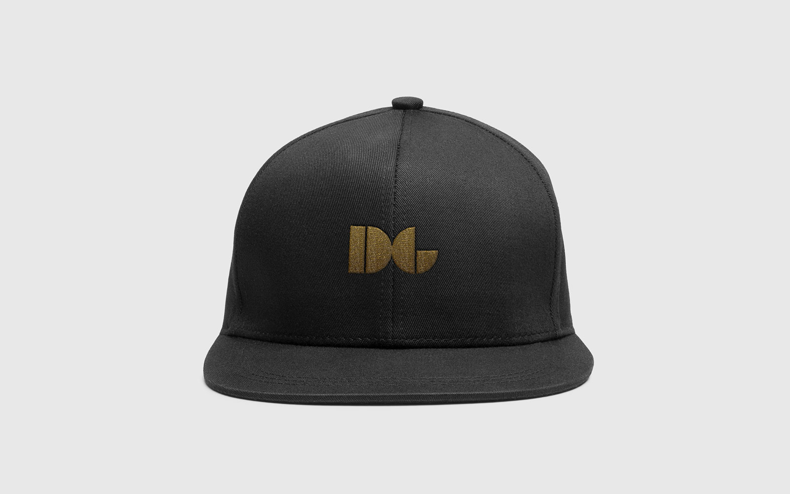
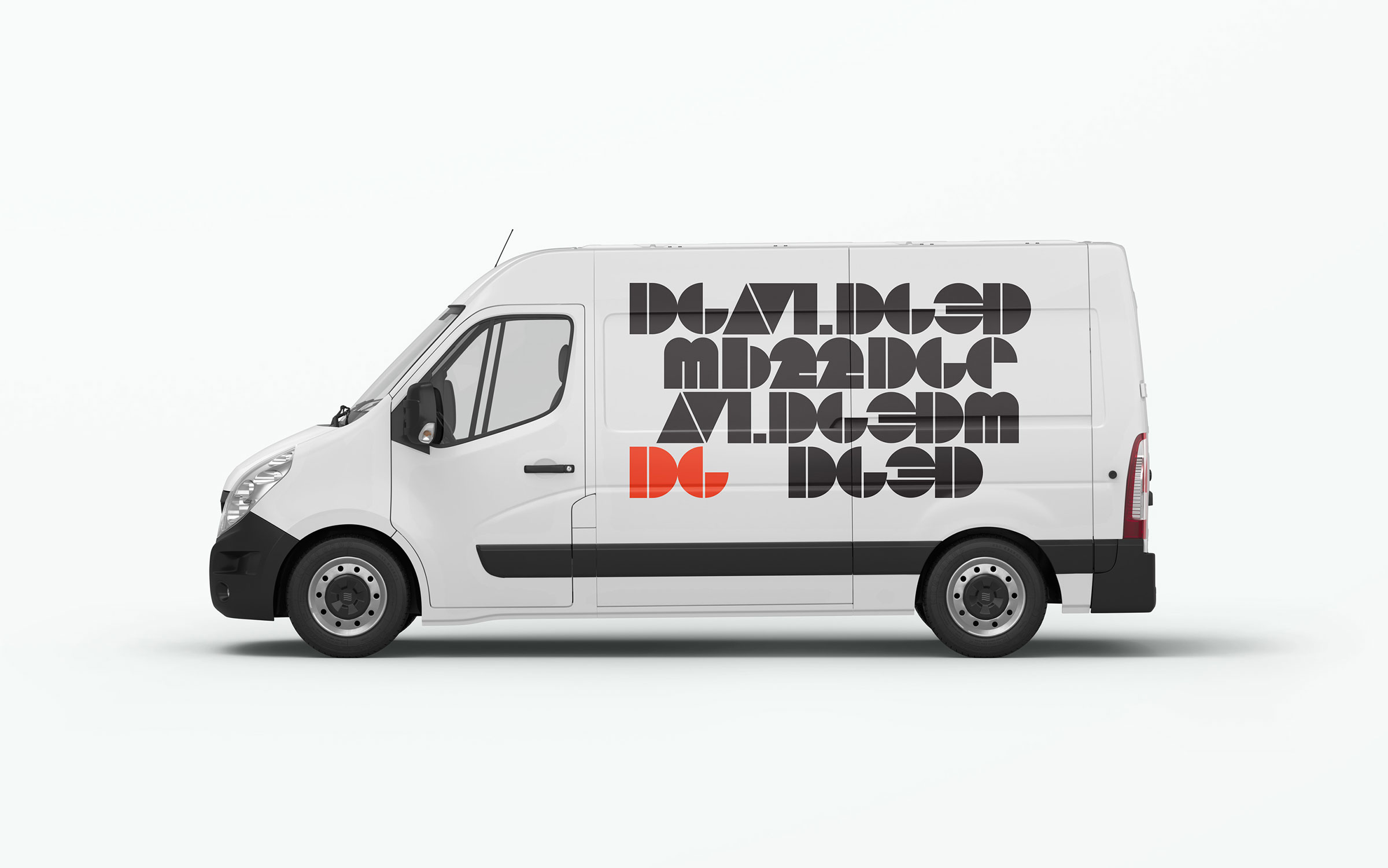
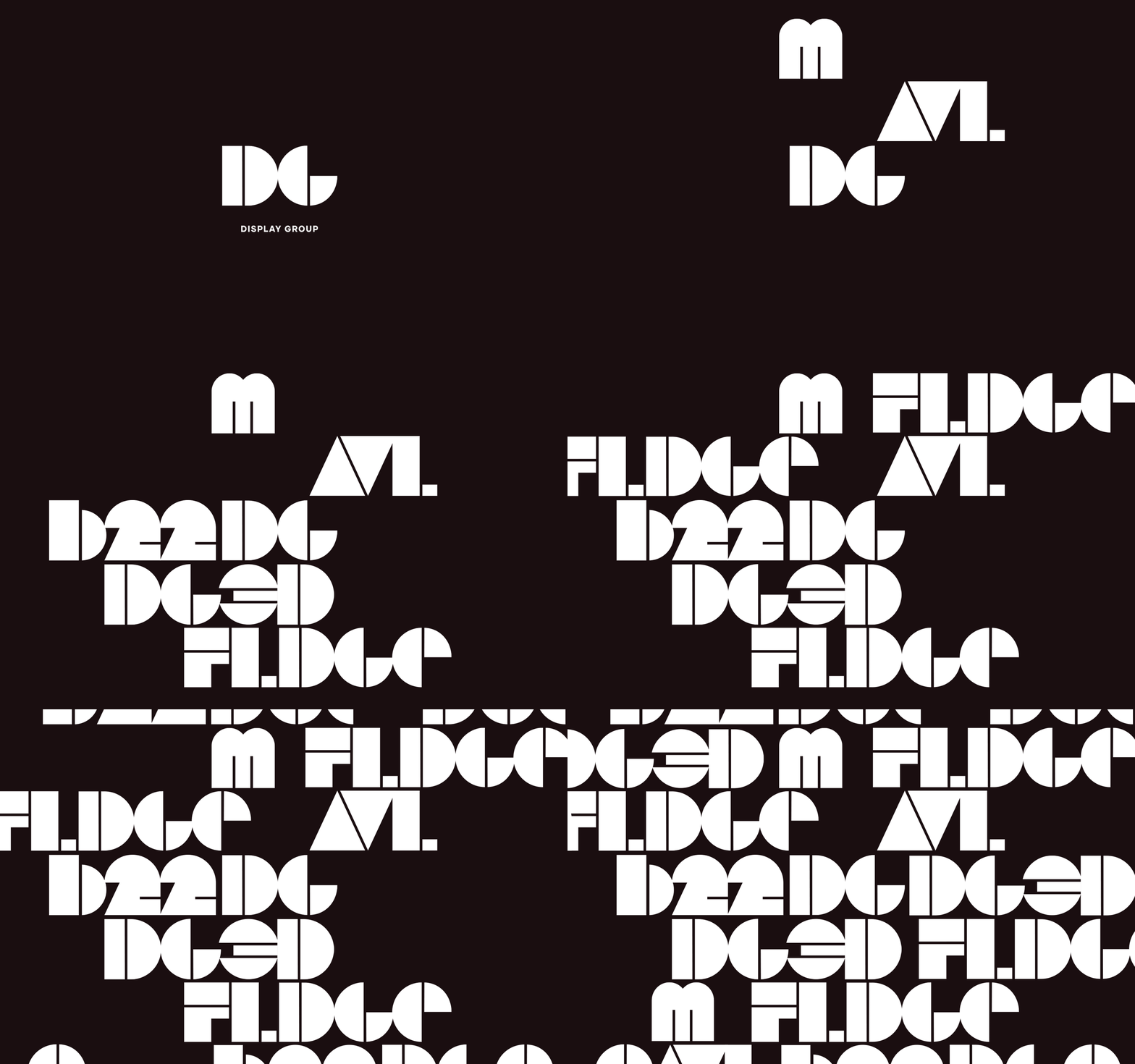
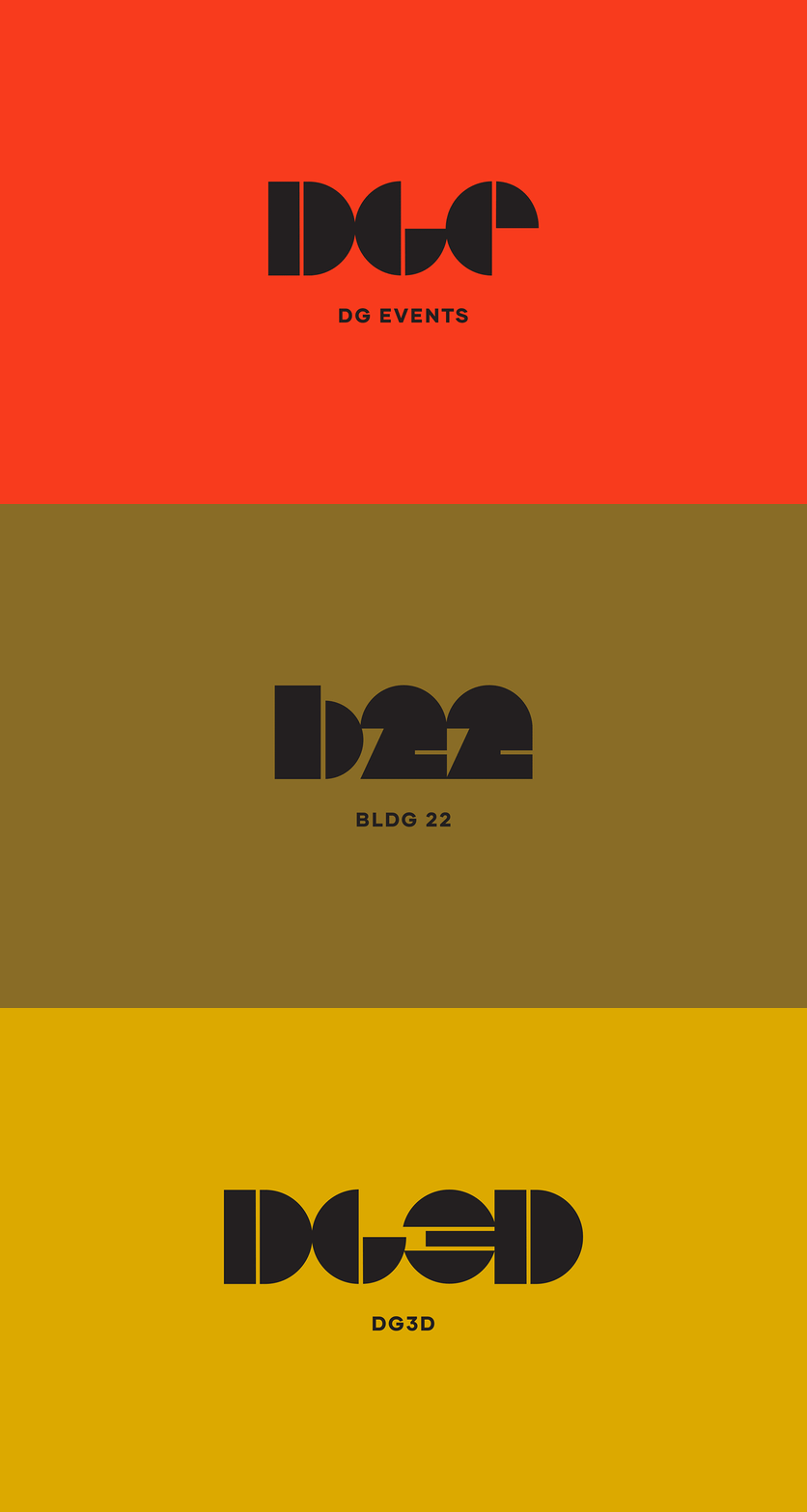
Each company within the creative collective was given a bold geometric icon that creates a distinctive language where the icons can live on their own or together to create a pattern.
Display Group
Display Group is a pioneer and leader in the live event industry with roots that go back three decades in the city of Detroit. As they approached their 30th year in business, Midwest Common worked closely with the DG team on a full rebrand.
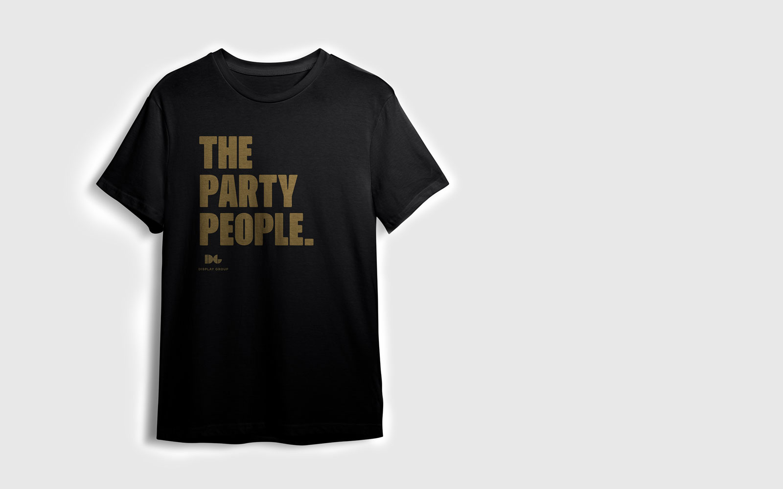
The goal was to create a cohesive visual system for their expanding collective of companies while giving each their own unique place. With a focus on brand strategy and design direction Midwest Common created a distinctive graphic language and key messaging with a playful and approachable aesthetic to match the energy and excitement of the event industry.
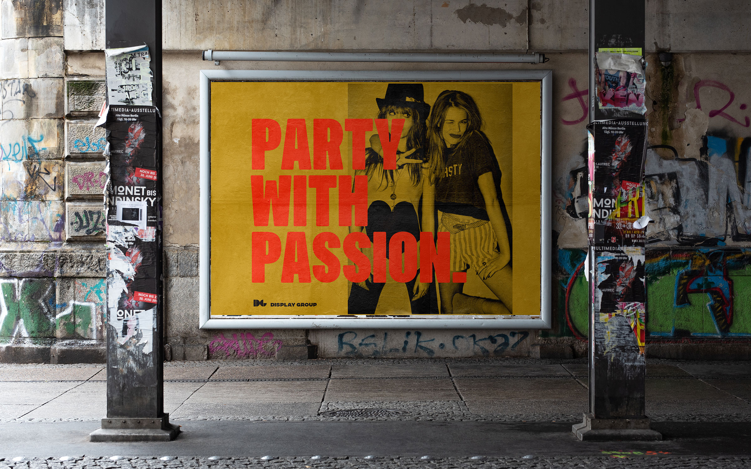
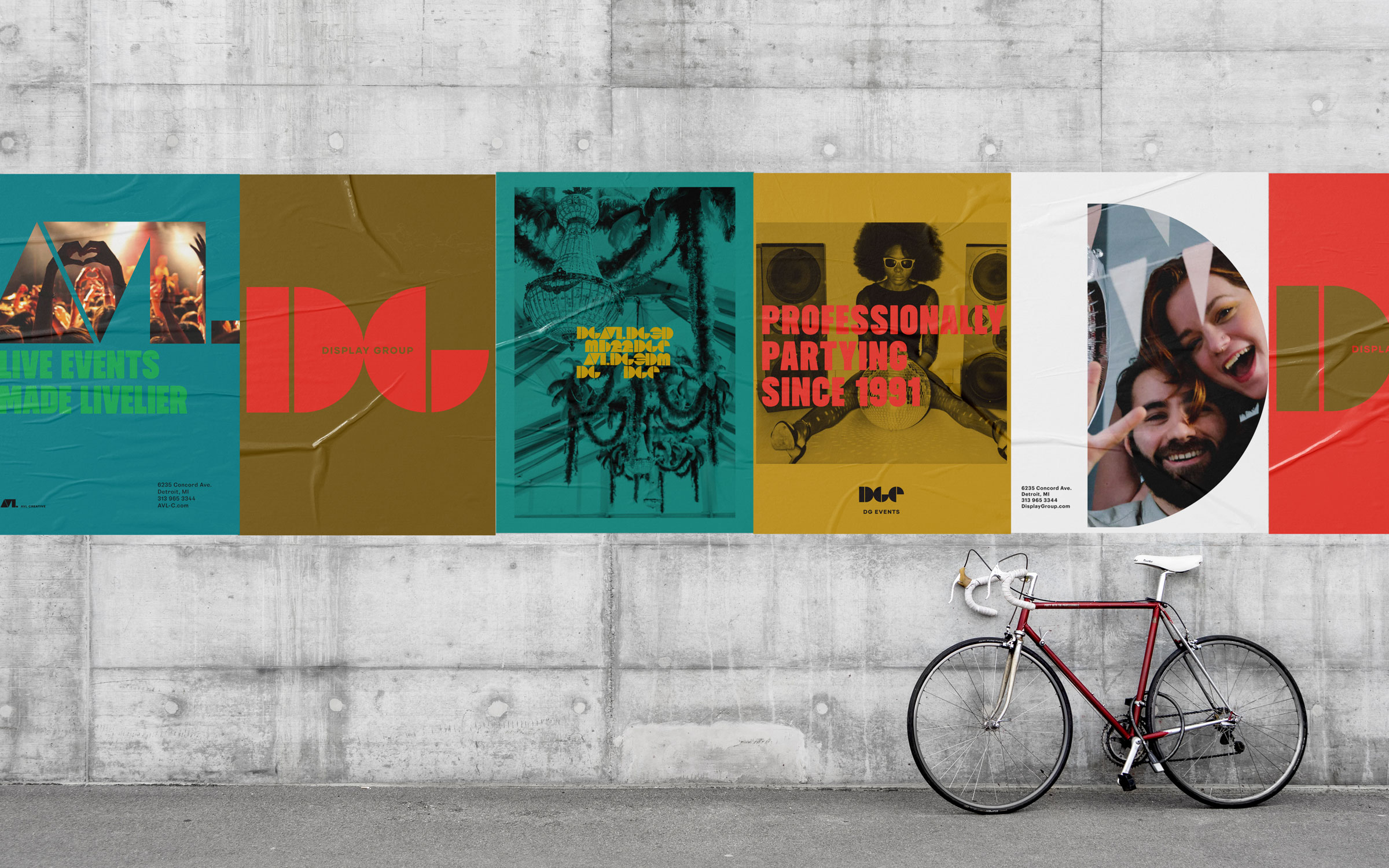
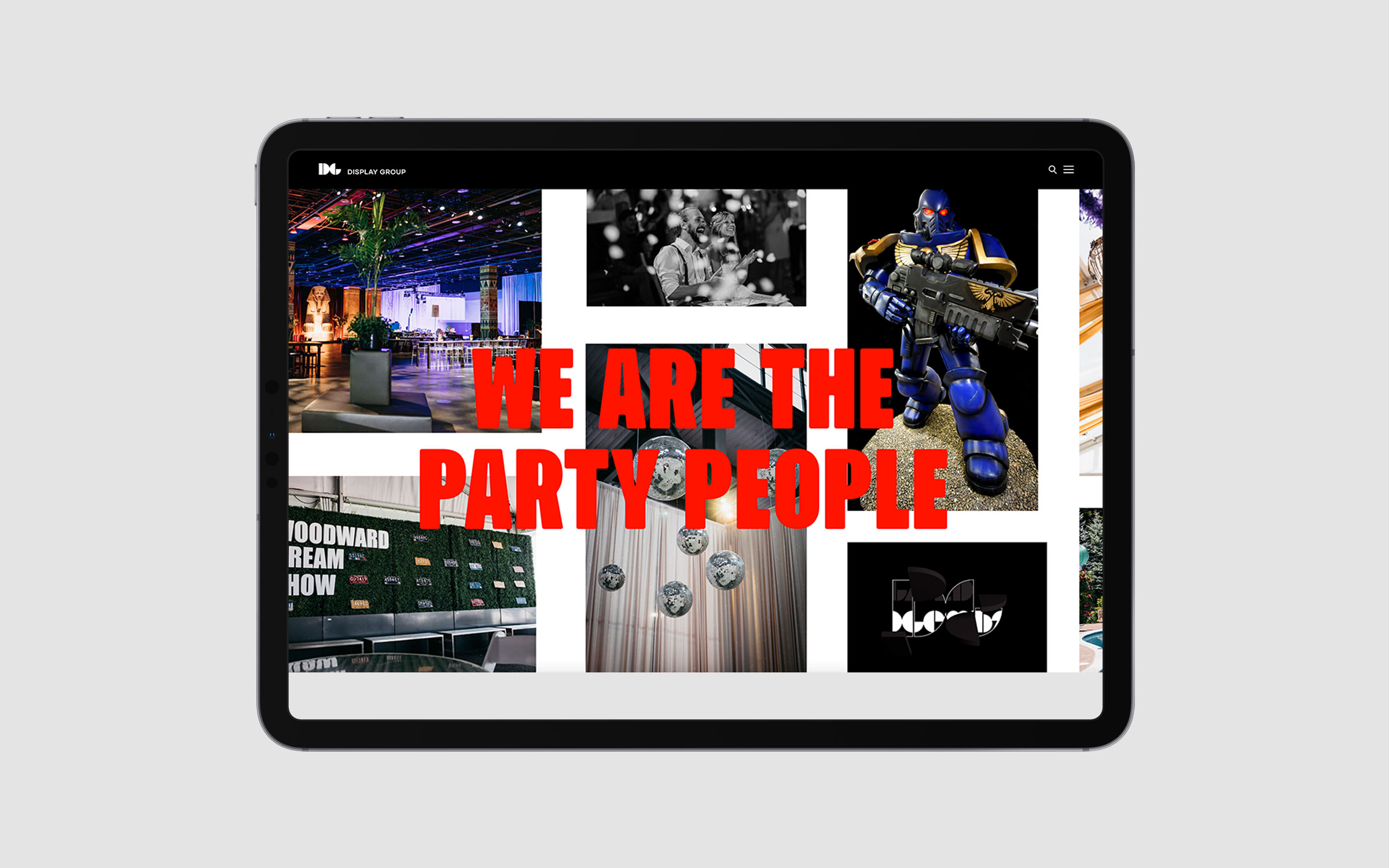
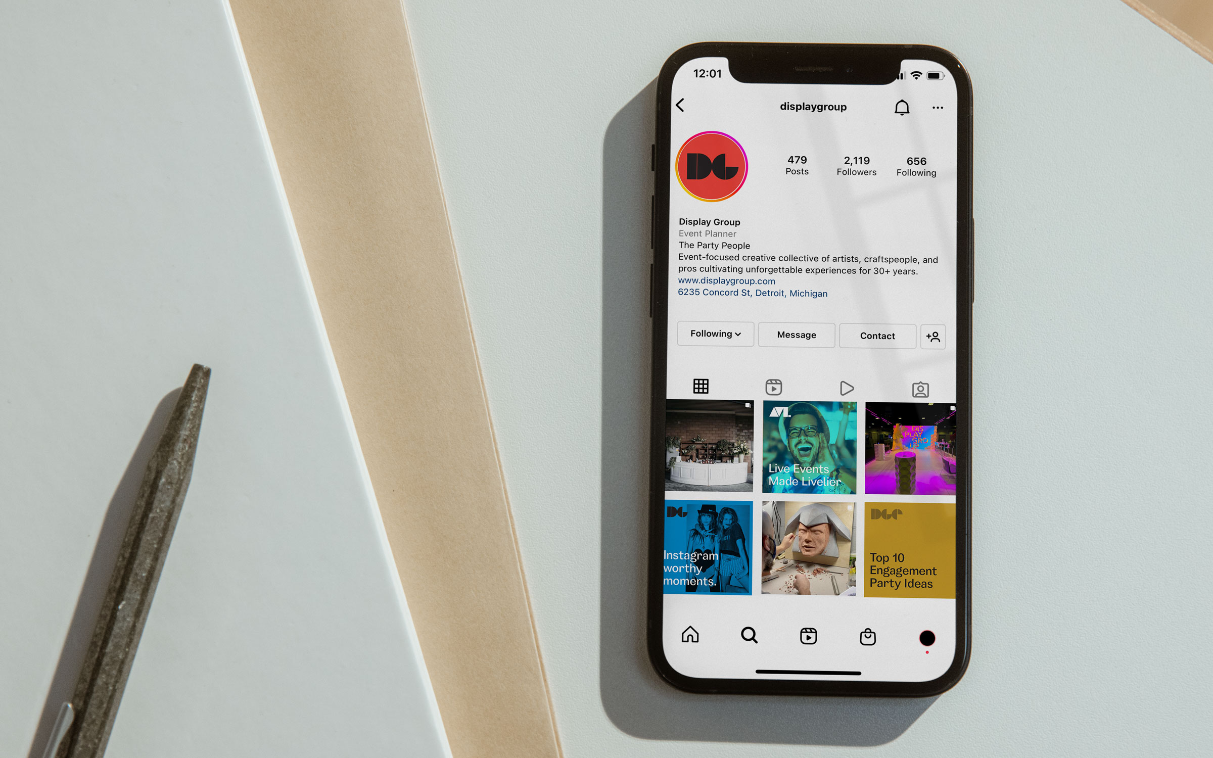
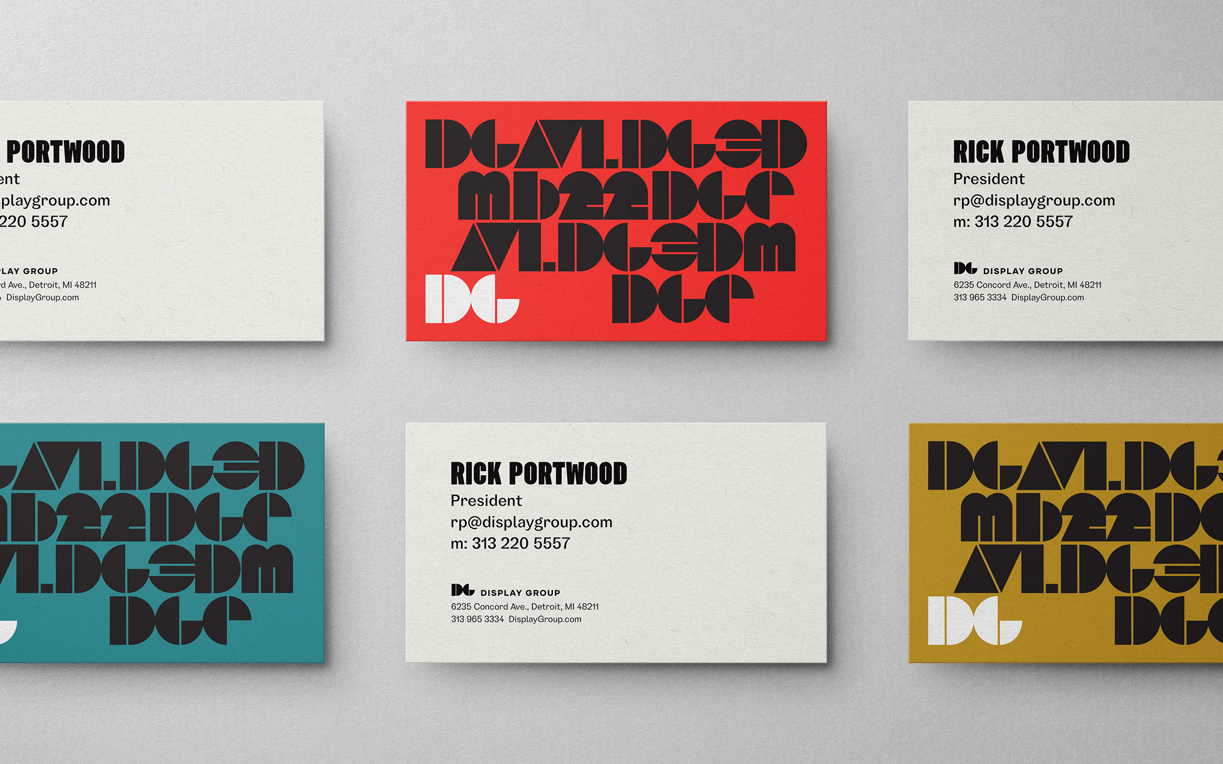
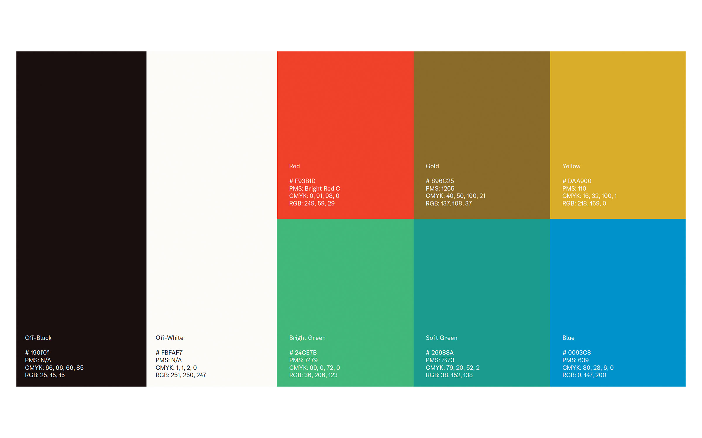
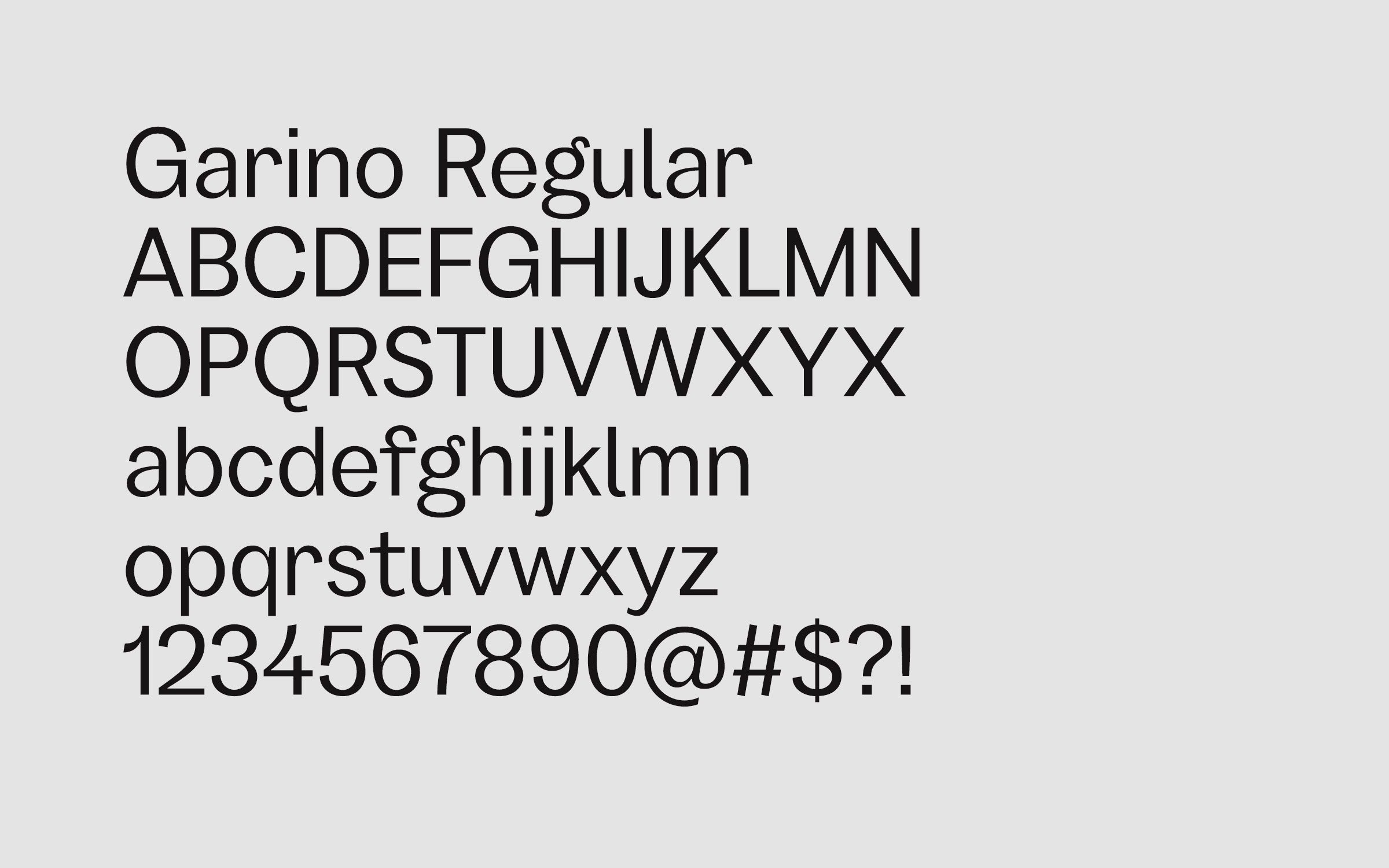
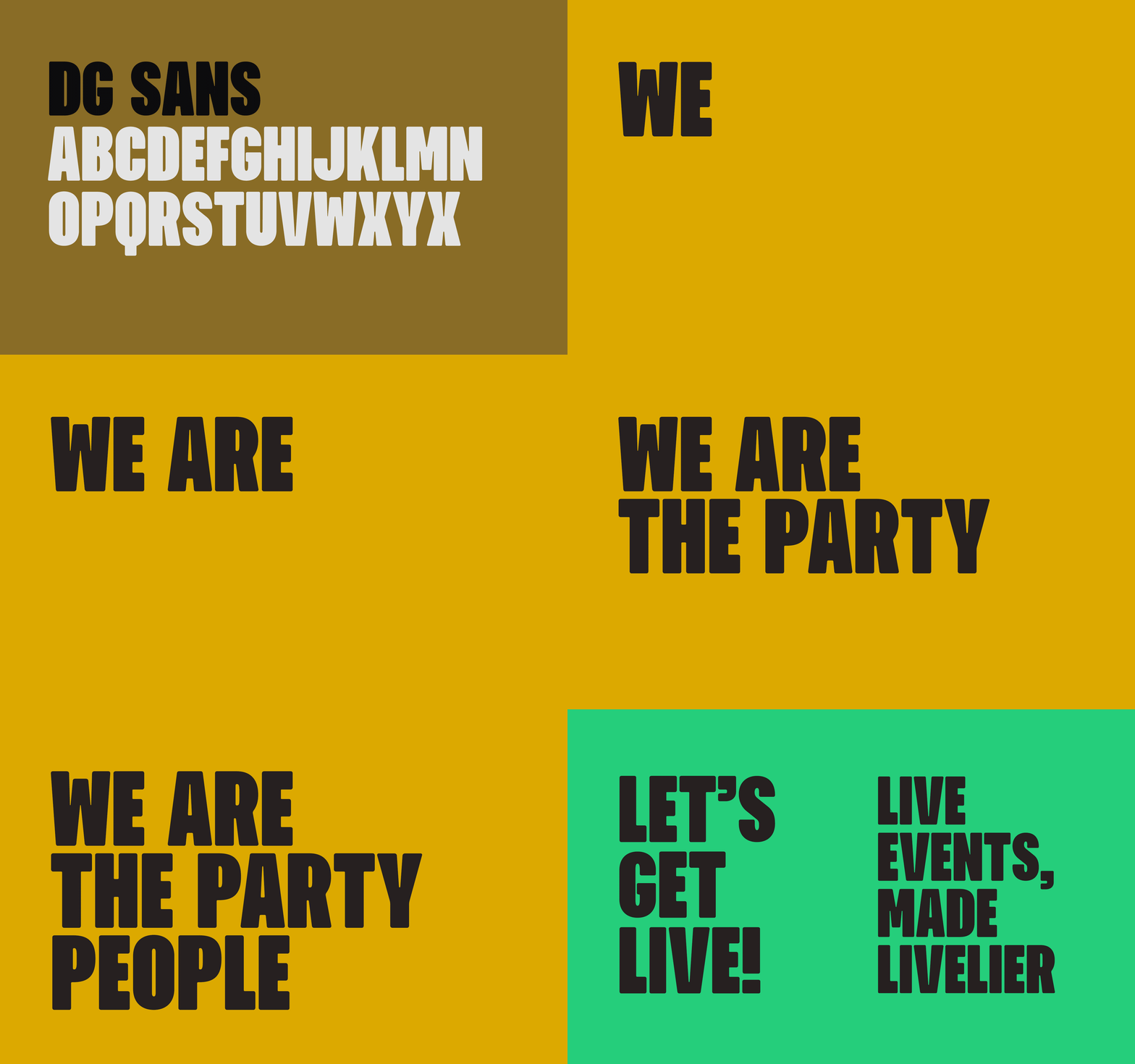
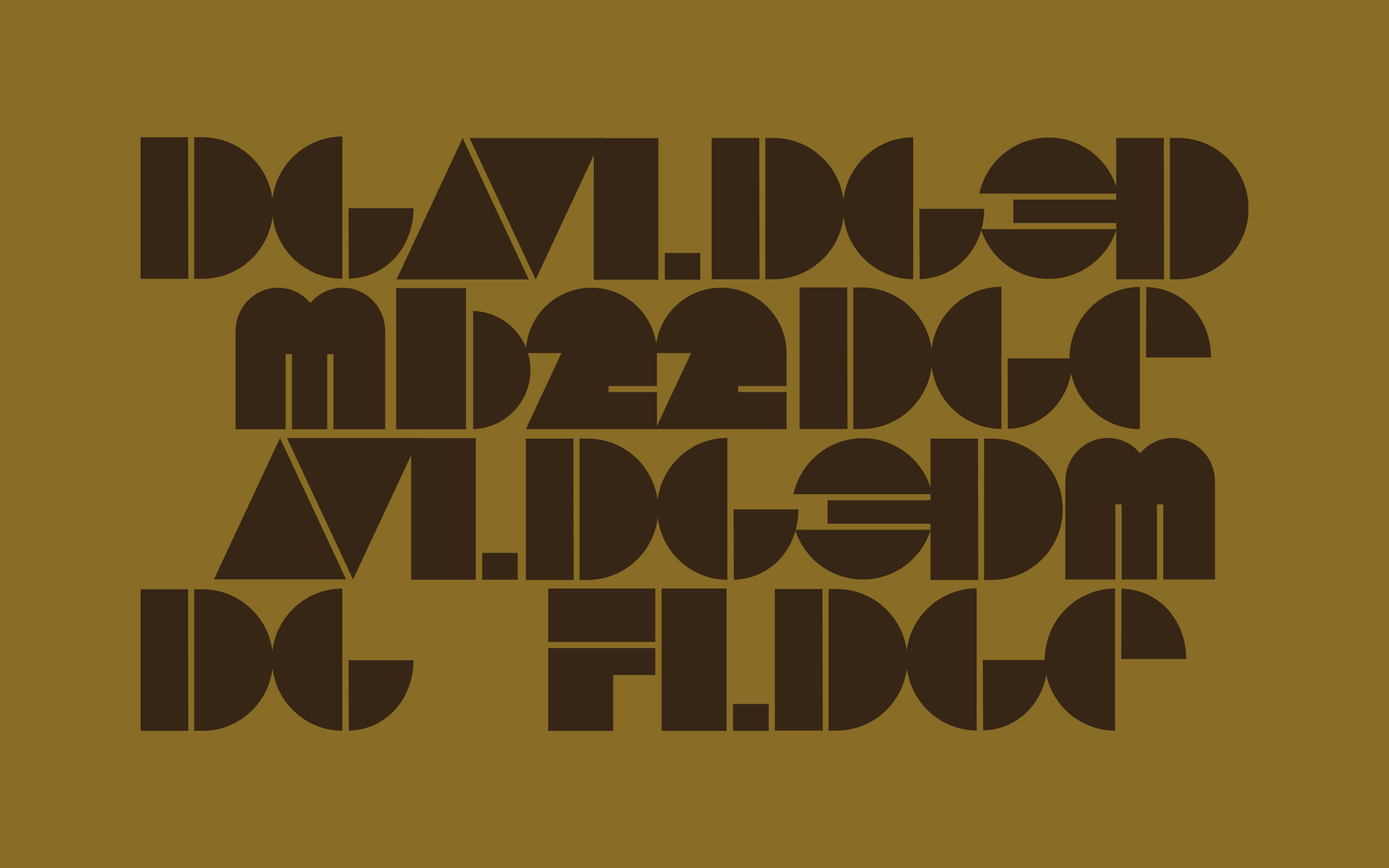
Color and typography play heavily in the new visual system. A soft black and off-white are the foundation of the palette and work alongside vibrant hues of red, yellow, green, gold, and blue. Julien Fincker’s modern san serif Garino is the primary typeface. Midwest Common also created DG Sans, a bespoke typeface to be used for headlines and specific calls to action.
